MAK (Austrian Museum of Applied Arts / Contemporary Art)
- Address: Stubenring 5, 1010, Vienna
- Tags:
 What to see Vienna,
Vienna,
Austria
- Telephone: +43 1 712 80
- Website: www.mak.at
Why I love MAK & exhibitions I've visited [part 1]
I am not the kind of person who goes often to museums (probably should have more reasons than the others) but being in Vienna I found one which always kept me satisfied and motivated for everything after every visit. I have been there already five times and hope to go once again before I leave for Zagreb. Since I'm studying design it might have a slight advantage compared to the other places but the place seems to be very popular by all kinds of visitors.
So I'd like to share my experience with MAK (Austrian Museum of Applied Arts / Contemporary Art) and impressions & descriptions of the exhibitions I have visited in the past 3 months.
Let's start with some basic information and fun facts.
Location, Opening Hours & Prices
It is situated in the 1st district near the U-Bahn station Stubentor (U3) and Landstraße (U4), yet a bit closer to the Stubentor station (when you walk upstairs you're about 2 minutes walking till the main entrance). There is also University of Applied Arts right next to the museum and Stadtpark to the south. The main entrance is on the western side visible from the Stubenring street.
As for the opening hours:
- Monday closed
- Tuesday 10 a. m. -10 p. m.
- Wednesday-Sunday 10 a. m. -6 p. m.
Now the great thing is that the Museum has a free entrance on Tuesday from 6 p. m. -10 p. m.
If you're not lucky to find some time on Tuesday or just wish to avoid the crowds (although shouldn't bother you), here is the information on the admission & prices.
- 9. 90 € normal
- family ticket 13 €
- 7. 50 € for students (60, members of artistic groups and organisations... )
- 8 € for Ö1 Club members
- 17. 90 € / 14. 90 € (reduced) / Vienna 19. 90 € combined ticket
- MAK annual ticket: standard 40 € / youth 20 € / family 55 € / silver 30 €
- FREE ADMISSION - for children and youth under 19, disabled personas and persons accompanying and the rest is mostly regarding the Austrians....click here to find out more about the prices.
The guided tours are available in both German and English and the fee is 2 € per person except for children.
If you want to use the cloakroom it costs you 0. 70 €. Pay attention - if they see you with a big handbag or backpack, you will be asked to leave them at the cloakroom.
MAK Design Shop
There is another cool thing as a part of the museum. It's this design store which you can see right to the left when you enter the building (and escape the cloakroom).
If you're interested into such things I suggest you to check it out. You can find mostly books and notebooks on design and architecture, largely based on Vienna and Austria. There are many little interesting projects regarding life in Vienna, culture and also language. What I found interesting and useful were the notebooks and diaries nicely designed, standard ones but also those where you have different tasks to do or let's say "creative diaries". You can find board games, creative picture books for children and much more. It won't be boring for sure!
The prices are a bit higher than usually but not too much. If you want to buy a nice present for someone maybe you'll find it here. Also I'm very much satisfied with the quality. I have a tendency to touch, sniff and shake everything in the shops and I really like the stuff in this one. I'm sure you will find something for yourself.
Click here for more info regarding the opening hours and artefacts.
And now it's time for...
The Exhibitions & Shows
1) HAPPINESS - Talk by Stefan Sagmeister
My first visit and love for MAK started two weeks upon my arrival to Vienna. It was Austrian National Day and holiday on 26 October and there was a Talk on Happiness by Stefan Sagmeister - world famous designer who's been living and having his studio in New York for last 2 decades. I decided to go there and I'm very glad about my decision.
The talk was in German, the hall was full of students and we also followed the presentation with infographic and videos, finishing with singing 'The designer's song' at the end of the show. Stefan Sagmeister talks about his experience and thoughts on happiness, how did he achieve it, what he thinks any of us should do and how it affects both individuals and society. Now, I have already described the event here so I'm not going to repeat myself again.
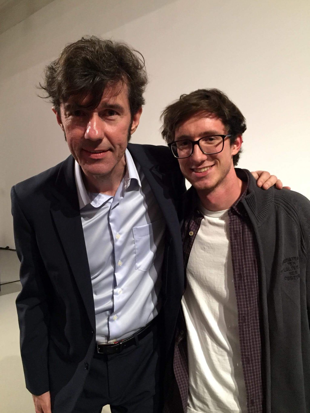
But have to add that had the opportunity to take a picture of him and get his autograph on my WienerLinien ticket. Very motivating, nice memory and a story for my colleagues later in Zagreb.
On the next day there was the opening (again with him) of Sagmeister's The Happy Show exhibition but I went to see it the other week.
2) Stefan Sagmeister: The Happy Show Exhibition
I've visited this exhibition 2-3 times alone and with my friends. And it keeps you motivated and satisfied maybe every time you leave the building afterwards.
The exhibition is divided into three parts - one part is below in the underground, the second one upstairs on the second floor and the third one on the last floor a bit hidden. But before you go anywhere, don't miss the opportunity to get yourself a ticket from the machine in the hallway. Press the button and you'll get a ticket with a written task in German and English such as Remove one shoe and one sock. Carry them and other funny things. Also, almost forgot, there are two giant balloon-dolls of a black and white monkey holding the notes Everybody always thinks... they are right. They are probably the first thing you notice once you enter the great hall of the museum.
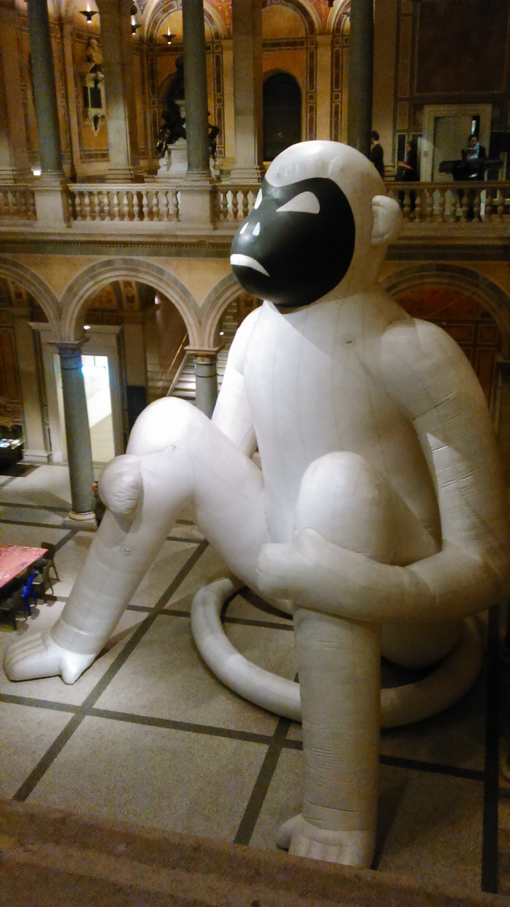
Now, I recommend you first going downstairs straight by the monkey's feet.
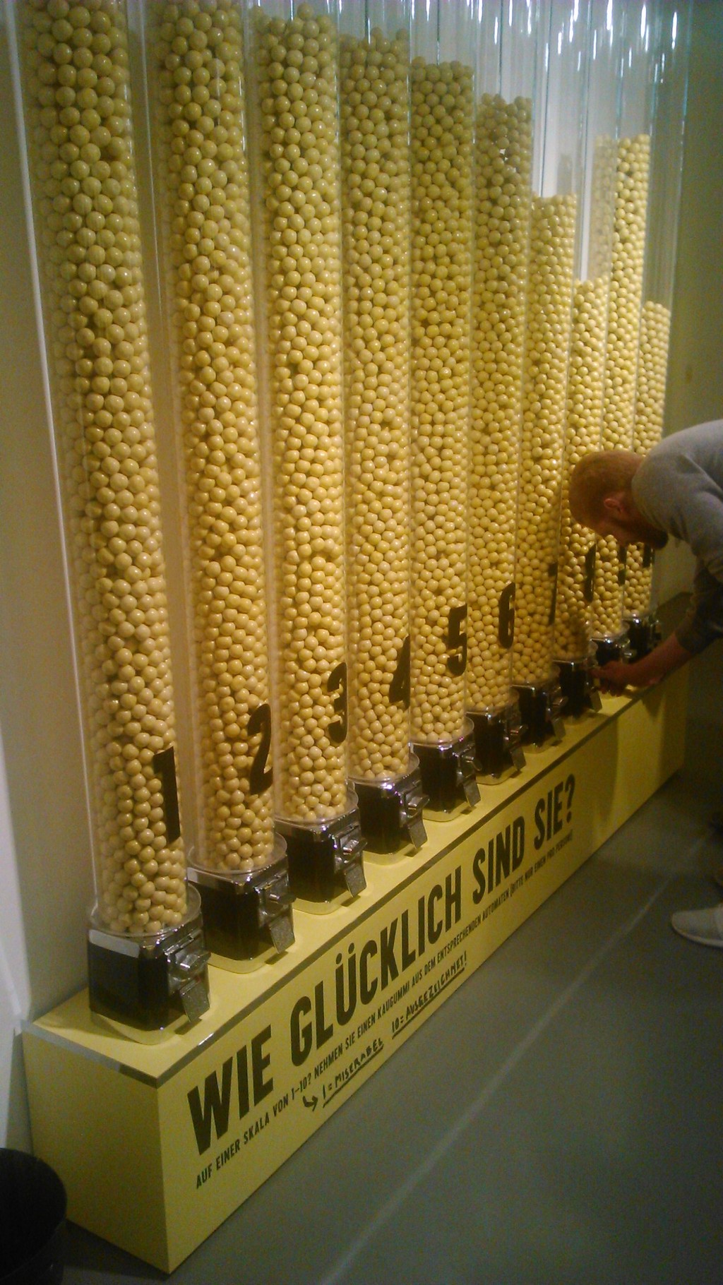
While walking downstairs you will notice the handwritten messages of Sagmeister on the walls with some illustrations. Once downstairs you'll see people trying to use the 'How happy are you? ' machine with chewing gums. This machine is kind of a symbol of the exhibition since it's made of 10 tanks filled with yellow balls. And yes - black and yellow are the colours of the whole exhibition. The principle is simple - you choose the tank and the number depending on how happy you feel. 1 represents literally I'm feeling sh*tty at the moment / my life is miserable and 10 stands for I love life, I'm feeling awesome!. There are two more big rooms with interactive exhibits.
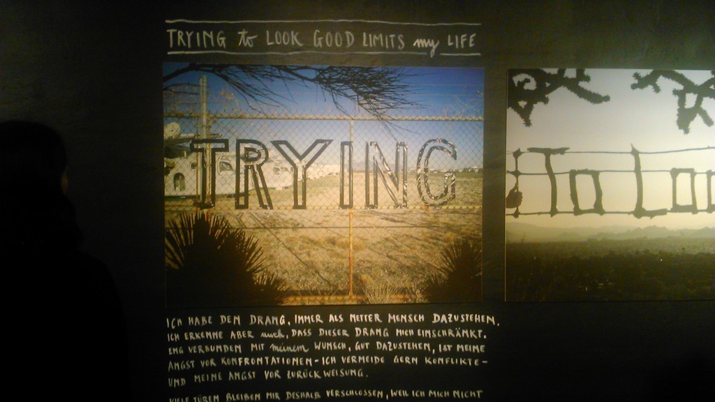
The relatively smaller space consists of 3 parts. First one is the fastest but the sweetest as you can take Sagmeisters favourite chocolate candy from Indonesia. Right behind is the interactive screen with spider's web where visitors stand in front of it moving their hands in different directions and follow the reaction on the screen. The movement of your body controls the central point of the web. And the last part is behind those two is much more spacious with the pictures, photographs and infographics on the walls. You can find Sagmeister's typical stlye in design (as he says he loves and prefers): crossover between typography (the text) and the photograph. There is also an infographic of how much, according to him, a person earns and where is the limit of 'having enough' and making you 'happy' or not any more about it.
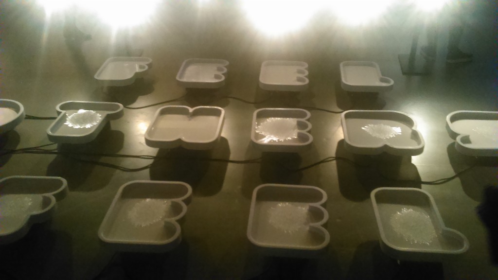
The next room is twice bigger. And we find the interactive exhibits here too.
Firstly, there are three big screens that play 5-10 minutes long video of Sagmeister's film about Happiness. First one is a silent documentary with German subtitles showing different stages of the shooting of the main film with his research and trials in public to do something. And the other video shows creative solutions of children when asked to draw their own animals. Interesting to watch. Right next to it you can find a round table with the yellow paper and markers to try it yourself. In one corner you can try to produce colourful lights in motion on the models ahead only by laughing. And on the floor in the middle are many cups filled with water and shaking. The cups were shaped to form the words Feel others' feels.
At the same floor there are other exhibitions but more about it later.
Back on the top and moving to the second floor! There you will see lots of infographics telling a story related to life and death, friendships and relationships, happiness in the world and his last thoughts. There are lots of visualised numbers so the statistics should be interesting to read. I think I don't need to suggest you to stop by since I haven't seen a person ignoring what's being shown there.
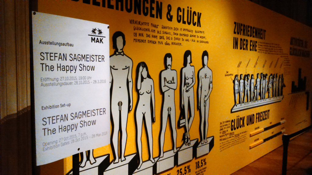
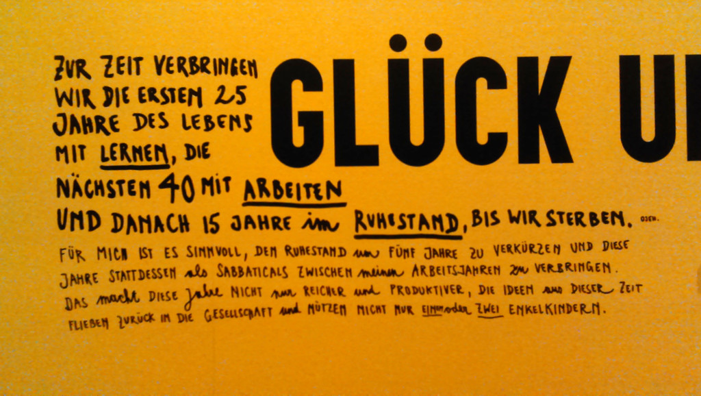
The third part can be next to the permanent exhibition 'Vienna 1900' and some might miss it since it's a bit hidden. You can reach it by walking through another exhibition on the second floor in the NW corner between the infographics. Then climb up the stairs. There you will see the bicycle which driven by the energy of a person riding it starts lighting up the letters and words in front of you. By riding a bike for a minute or two you will see that the light color and text change. The last thing is the projection of a video for the meditation. But honestly I haven't been patient enough to watch it, also the space there was a bit too crowded every time I came up.
All in all, visiting The Happy Show is going to be an interesting adventure worthy of your time. Some find it too much about the feelings but in the end it's very motivating and makes every of us thinking about what we can do, try to avoid doing and change in our daily schedule and manners. The exhibition will surely attract more students of architecture, design and arts but in general it proved to be very visited with positive feedback by everyone else as well.
The exhibition is open until 23 March 2016.
3) Christoph Neumann - Drawing the line
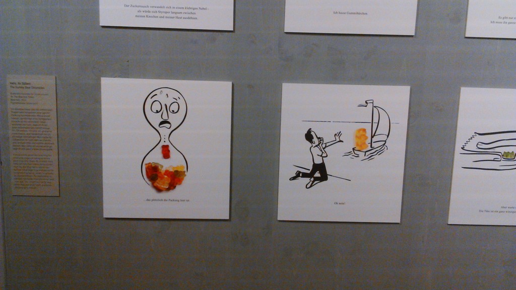
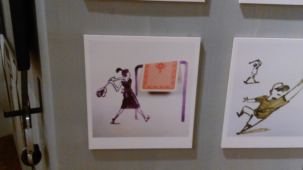
I was lucky to check this exhibition day before it was gone. It was an exhibition of the illustrative work of Christoph Neuman, German graphic designer who had been living later and worked in New York (and still does business with big names such as The New York Times, Google, Herman Miller... ).
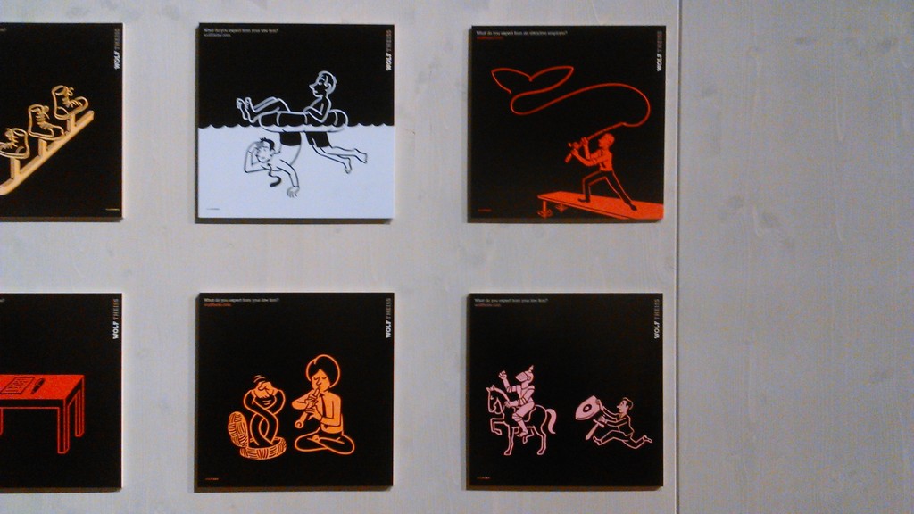
He has a simple yet unique style with messages. As his states - he wants the illustrations to provoke your thoughts. Many of the posters and illustrations I saw were related to some political or ordinary life situations represented from a different perspective. What I found cool was that he didn't limit himself only to the classical tools such as a pen and pencil but used in combination with 'material from nature' such as leaves, wood etc. to create illustrations. More about him you can find here.
4) 100 best posters from Germany, Austria and Switzerland
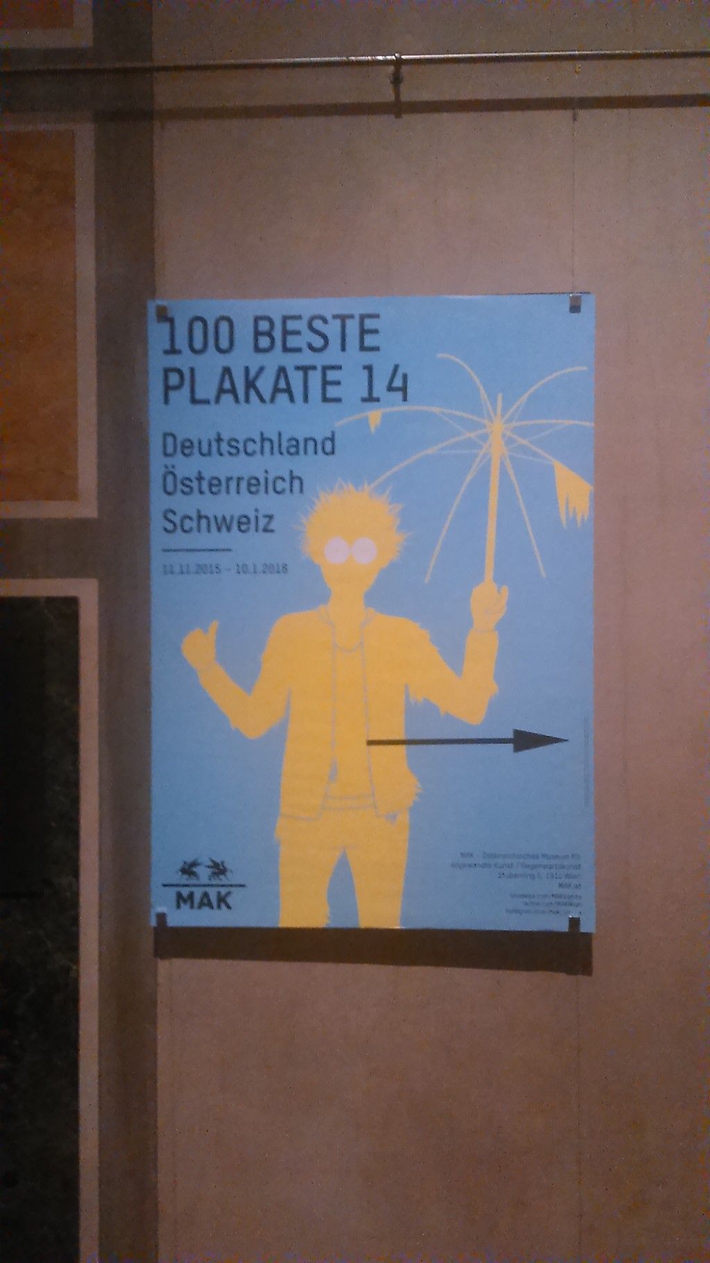
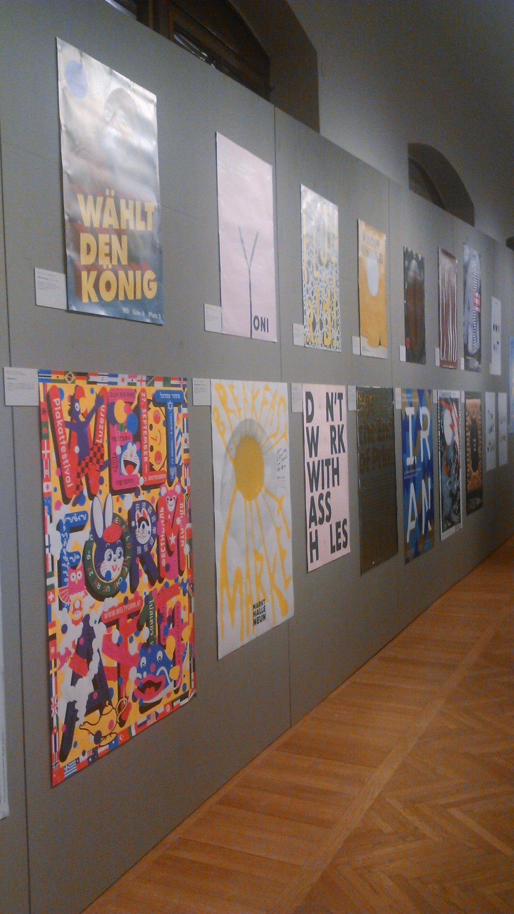
As the title says you can check the collection of the chosen '100 best' posters from these three German speaking countries. Personally there are some posters I wouldn't put in exhibition as I believe there were much better choices but anyway...it's worth visiting. I have also seen it 2-3 times and remember mostly simple ones and liked those with typography as the main tool of expression. And illustration of using some simple techniques in general combined with typography is what I prefer. When there are too many things it's just.. to much. Remember Mies Van der Rohe's quote More is less! .
More about the posters here.
Photo gallery
Content available in other languages
Why I love MAK & exhibitions I've visited [part 2]
Right! Let's continue with a few more exhibitions starting with the one of Josef Frank. If you haven't, please have a look at part 1 (basic info on MAK, Stefan Sagmeister Talk & The Happy Show, 100 best posters from Germany, Austria and Switzerland, Illustrations of Christoph Neumann).
5) Josef Frank - Against Design
Another exhibition that's been running since 16th December and is still available to visit until 3rd April is of Josef Frank. Let me tell you a few facts to better understand the exhibition. Since I'm not much into the architecture it might not have been personally as interesting as Sagmeister's Happy Show but nonetheless very interesting and educative.
Frank was of Austria's most important architects and designers of the first half of 20th century but his ideas and work are still of importance and have had influence in the modern times. For instance, he was included into the shaping of the 1st Bezirk in Vienna, precisely about the Stephansplatz. He spent his first part of life in Austria before being forced to move to Sweden due to the rising antisemitism in the 30s of the previous century and later to the US where he stayed and worked till his death.
Now the title 'Against Design' sounds a bit strange and I wondered what to expect. And here is an explanation to this mystery while reading the texts there. Frank was a critical designer and architect but had an idea of using the space not specifically for some purpose but to be 'available' all the time to different needs. Also, not only the artists and architects should be able to create a good home for us but other professions that have nothing to do should be able to design their home good for their measures and standards. This would of course lead to what is known as 'kitch' (Kitsch) or a bad taste but he supported the idea of people making their own comfortable by their own desires. And as mentioned the thing with the space - he said that no room or space in the apartment or the house should be 'fixed'... meaning that if you want to have a couch in the kitchen, you should be able to do so, without limitations. Of course, such things are probably not going to work out as today we still prefer to have things organised.
What about the exhibition itself?
There are again three major parts. The first part is about the architecture and the models. Once you enter the exhibition hall you'll most likely go through the posters of the houses and apartments of the first half of the 20th century. I guess this part is much more interesting for the architects rather than for the designers and artists. But it was fun to follow the thoughts and look at the pictures. Many of them are today considered to be an elite property.
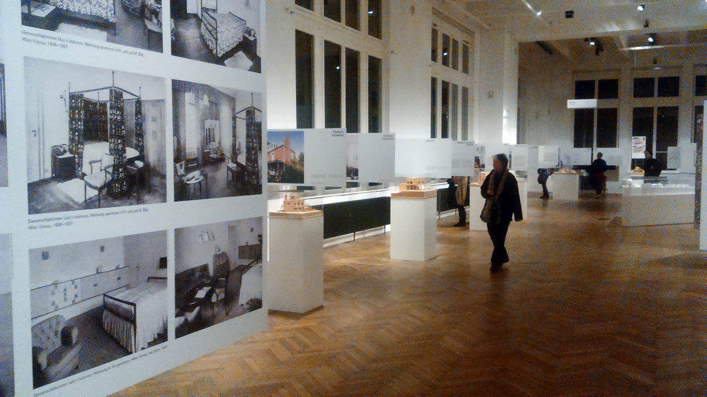
The next part is about the colourful textures for the furniture you've seen on the poster. But it's not only about that. First while walking from the models you'll notice the huge layouts of the Stephansplatz and the ideas for it's renovation and solution of the square and nearby streets during the mid-20th century. It is followed by his paintings and sketches of futuristic or unreal housing as well as some ideas for the clients. Very interesting! The next that followed was some cuts of the textures and patterns that were going to be used on the furniture later.
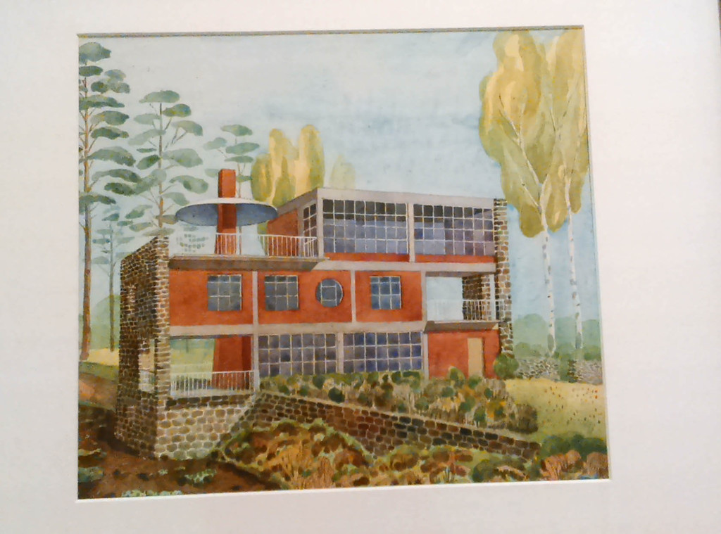
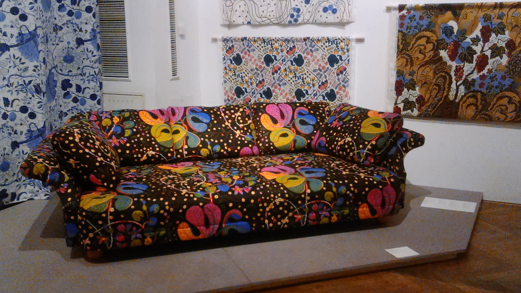
But I did not find this much amusing as other parts. Finally, the last thing in the spacious corner were the furniture (couch, chairs... ) with those vivid textures and patterns. Alongside them there were huge carpets hanging from the walls with very unique motifs and the style they were done in. I couldn't resist not to touch the couch with flower patterns in the corner, it just called the visitors..
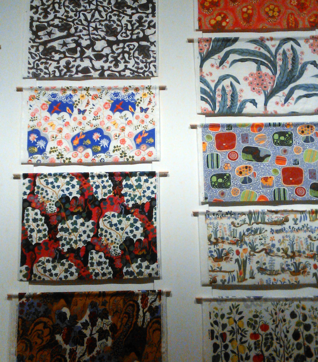
Another 'transition' into the 3rd part of the exhibition was a row with giant frames with pictures, illustration and text on different styles in architectures (or movements) in the 20th century related to our topic. And it was followed by the wooden stairs that lead to the low second floor. I climbed up to check what they have and there you can find more sketches and designs on the chairs. Also as you go to the other side of the wall (and stairs) there are some examples of the chairs' "feet" and how advanced they probably were for the time back then.
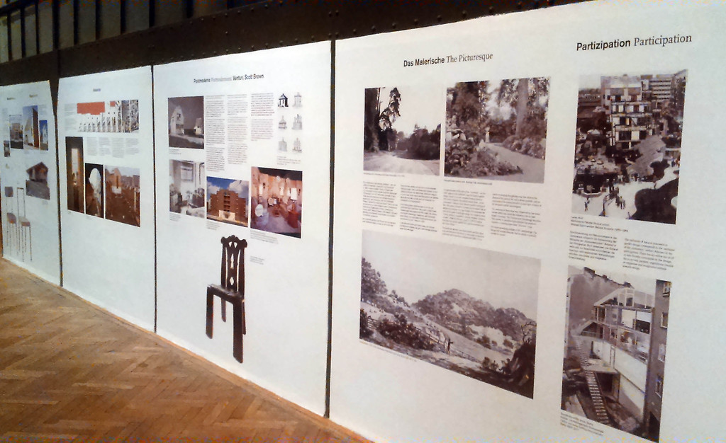
The 3rd part well... also has another part so let's say 3 of 4 parts. In the last corner you can find huge posters of photographs and layouts of modern architecture; apartments but also churches. And alongside the wall there were wardrobes and other essential furniture that can be found in every house. To enclose the exhibition we end up with many chair models whereas some of them were presented on the posters earlier.
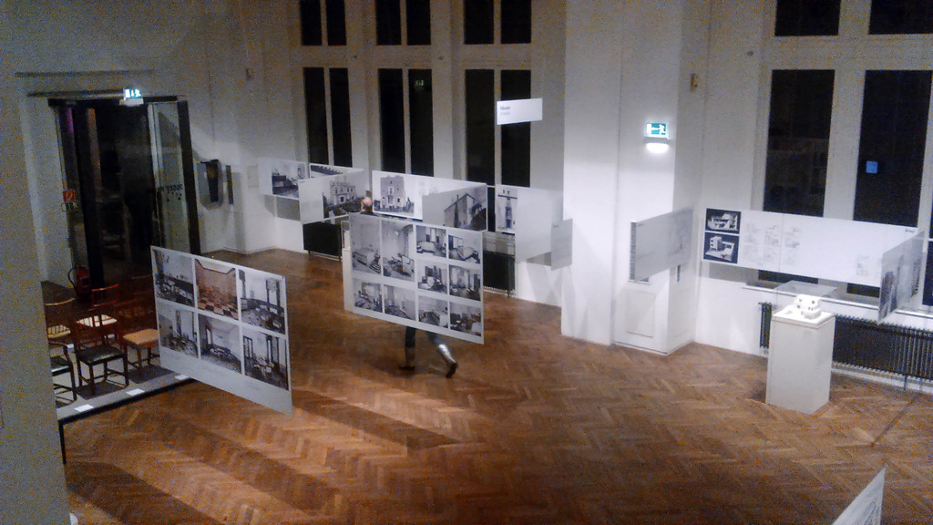
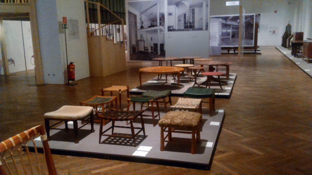
All in all, it was interesting to see something of local importance and also grateful to read the educative and informative texts. Some of the things I've known from before thanks to my courses at the University but not much. It was unusual to see the architect who went against the popular ideas during his time such as "forms follows function" while his proposal of the concept based on the thing that not only professionals such as architects should build other people's homes, that not only design should be there but also type of furniture that satisfies everyone... and that every item in the apartment should not have its fixed place but rather be sorted by the wish of the owner. This exhibition made me more curious about the author and his influence on the urban landscape of Vienna.
6) MAK Design Lab / Redesign of MAK Study Collection
The more I think of this exhibition the more I want to see it again. Namely, the first time I visited it I just didn't pay as much attention as I should have. But writing this text right now I realise there is much more to see. What is more, this exhibition is pretty diverse in terms of what it offers so it should be interesting to different kinds of visitors.
Firstly, this is a collection of the various artefacts, pieces of furniture, clothing, paperwork, plastic, metal... in general, of the representative concepts of design in the 20th century (but the previous ones as well). It questions the use of design in daily life, its boundaries with art and other fields and some thoughts on life-long learning process.
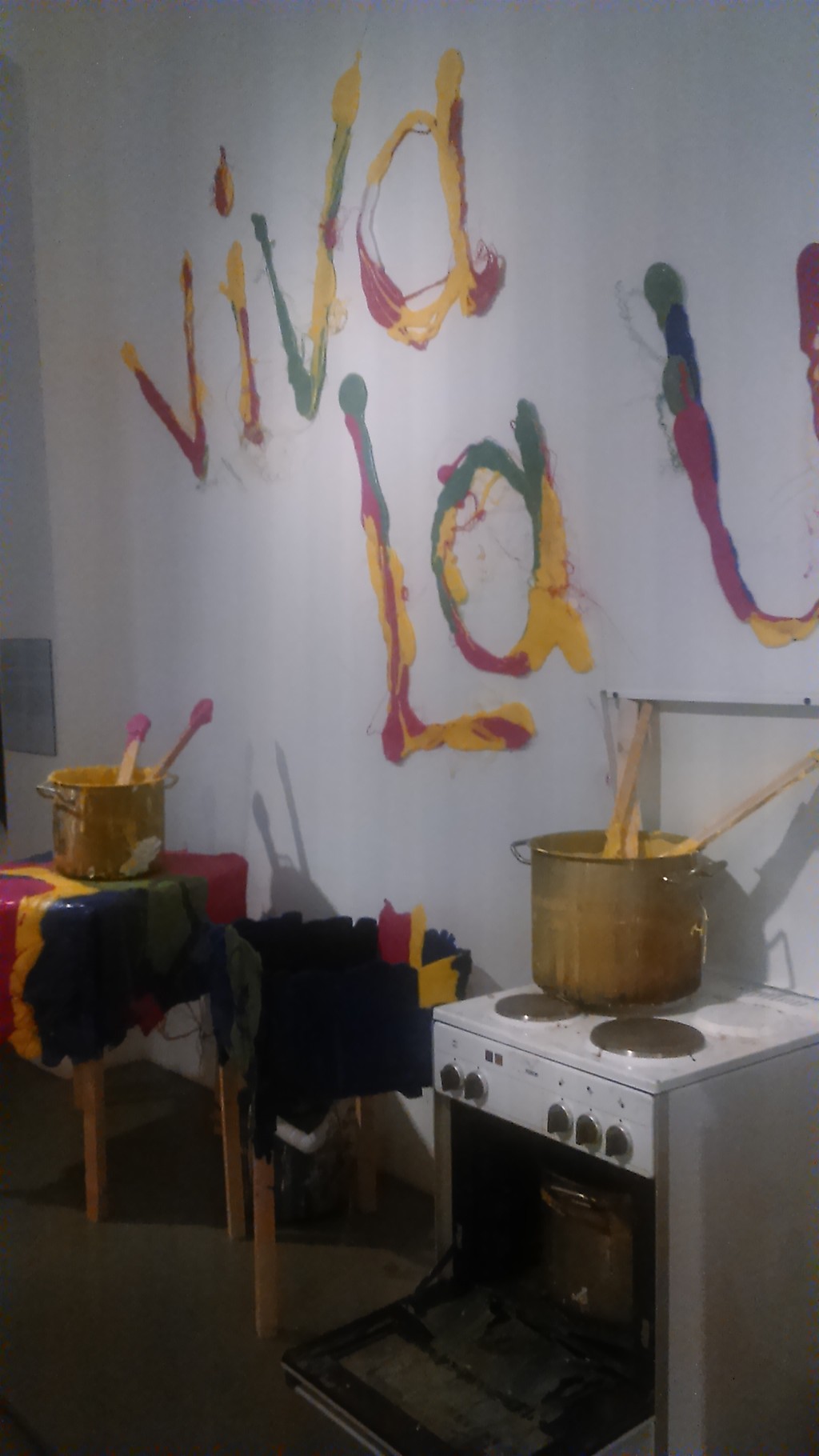
You will see how each of the design principles has had influenced each period of the previous centuries and moreover - not only for the "sake of design" but how it was used in the everyday life. You will see how important were design/arts and crafts during the history and how we got here today.
Now some of the things that come on my mind when mentioning this exhibition that have had impressed me obviously are the department about the kitchens, the rewarded designs of their time shown chronologically on the timeline and the last books and posters from the earlier centuries (remember Guttenberg! ) up to these days.
But there is far more to it. Actually I remember now everything except for the clothing part with fashion design... for obvious reason.
So let me please use the titles of the different parts of the exhibition found on the official page. I will try to give you my personal overview of each part.
-
Production
Here you can see a lot designs of the previous century that has been developing and being improved through the decades. Most of the models (and there are real size or a bit scaled to fit the room) are tagged with year of production and date of being rewarded. I found this very interesting. You can see the first 'hit' headphones that looked like giant cubes. There were toys, the black rockers'/motorcyclists' jackets, the football, comic books (Mickey Mouse! ), models of the machines...
And I might have forgotten to add - it was not only about production in technical sense but also artistic. You can find some of the experiments in the use of the material in a form of the big shoe.
-
Cooking
I also enjoyed looking at the items being shown here. You can find small models of the kitchens reminding me of the houses for the dolls made for children, then lots of kitchen tools whereas some of them are not in use nowadays, the open ovens with the colour from the paint buckets! and much more. What you're going to see in every room is that there is a blackboard with markers where you can write something. Mostly there is a question or some phrase you can finish such as "my kitchen is.. :" and find lots of creative answers. There is also an improvised kitchen where you can step in and see what it looks like (what it looked like).
-
Eating and drinking
This was well... didn't amuse me that much. I don't feel excitement when looking at the plates and cups (only if they were filled with food and drink! ). You can see different styles of the handwork through the centuries, what the dishes looked like on the table before. Lots of golden plates and forks, silver cups and those which were even illustrated. Let's move to the next part...
-
Sitting
Everyone likes to sit. We do it while eating, drinking, while watching TV or sitting in front of the PC, when wasting money on e-bay, while talking with our friends in the bar... and we want to feel comfortable while doing it. Then we need a well designed chair which fits the ergonomic standards, that is visually appealing and not going to collapse after you sit on it.
In this row you can find different design solutions of the "sitting tools" that were developing through the last 200 years. It ranges from the common home furniture to the chairs used in the bars and saloons.
-
Helmut Lang collection
I'm sorry to disappoint you but I didn't pay much attention to this. Helmut Lang is a very influential fashion designer in the last three decades and his work is on display in many museums worldwide. But it was not something that caught my eye...
-
Textile collection (19th century)
Apparently the collection with the patterns for textile dates back to the first half of the 19th century, something like a fashion of the Habsburgs'. Since it was about textile production I guess it was the result and a consequence of the industrial revolution and first successful factories.
-
Ornament
Another part I had little interest into... but looks more interesting than Helmut Lang's collection (respectively). This was also a result of the efforts made by MAK in its first years to document and collect all the handwork and art that represents the use of ornaments and to show their use in daily lives.
-
Transportation, protection & decoration
Unfortunately I also quickly went through this and do not remember much... I'll go again to the museum and give you more information on this.
-
Communication
Luckily, I stopped by these exhibits.
In one room one can see the huge lap from the early tries of the Europeans to move on with the technology with the press and modern use the typography. You can see the old books printed since the Renaissance, what were the concepts and ideas back then... and modern principles of using typography, organisation of the text, experimenting with the shapes and size. There are also some of the iconic posters or representatives at least of the previous century. For example, most of you have heard of Wiener Secession or German Jugendstil that arose at the beginning of the 20th century - their typography and illustrative style. You can find them not only as a part of this exhibition but also in the other corners of MAK.
There might be something else I skipped, will go as said again to the Museum to check it. But for sure it pays off! I refuse to believe that there isn't something for you out of so many categories.
7) Asia China-Japan-Korea (Permanent collection)
This one can be found on the ground floor in the corner. I've been inside two times but maybe "miss" something more... or expected more. Nonetheless you should check it. It comes as a good break after seeing the Western art. And here are few words about it.
As I've heard some of the exhibits are from the private collection and also one of the most important exponents of the Asian part of the Museum. And there is one name that did a lot to make this exhibition come to life in MAK. It's a Japanese artist Tadashi Kawamata whose concept you can find in both German and English right to the entrance in this small hall. His main idea was that there should be a play between light and shadow and he decided to put his exponents in the vitrine. The visitors can go around them and enjoy the Asian work.
Since I've been to Japan last summer I was more than usually interested to see something here. You can find statues from the temples, artwork on the paper, beautiful calligraphy and the iconic landscapes... some glasses and vases... and of course there has to be always a sword of a samurai.
This is never overwhelmed by the visitors, mostly it's max. 4-5 persons at the same time in the room so you can enjoy observing the artefacts in piece and quiet.
Coming soon:
8) Vienna 1900 (Permanent collection)
9) Carpets (Permanent collection)
Thanks for reading.
Photo gallery
Content available in other languages
Rate and comment about this place!
Do you know MAK (Austrian Museum of Applied Arts / Contemporary Art)? Share your opinion about this place.


![Why I love MAK & exhibitions I've visited [pt2]](https://d1bvpoagx8hqbg.cloudfront.net/75_75/why-i-love-mak-exhibitions-ive-visited-pt2-1d033423f63490c724c028943095908d.jpg)
![Why I love MAK & exhibitions I've visited [pt2]](https://d1bvpoagx8hqbg.cloudfront.net/75_75/why-i-love-mak-exhibitions-ive-visited-pt2-8b6e9ef670f8ac50646451353fa45859.jpg)
![Why I love MAK & exhibitions I've visited [pt2]](https://d1bvpoagx8hqbg.cloudfront.net/75_75/why-i-love-mak-exhibitions-ive-visited-pt2-652c3f19ffdc46d5fcf782ebc75761ae.jpg)
![Why I love MAK & exhibitions I've visited [pt2]](https://d1bvpoagx8hqbg.cloudfront.net/75_75/why-i-love-mak-exhibitions-ive-visited-pt2-10e142d7afa6871804d0384b63df498b.jpg)
![Why I love MAK & exhibitions I've visited [pt2]](https://d1bvpoagx8hqbg.cloudfront.net/75_75/why-i-love-mak-exhibitions-ive-visited-pt2-a8ed6904162954c95ba5b6c75ff54801.jpg)
![Why I love MAK & exhibitions I've visited [pt2]](https://d1bvpoagx8hqbg.cloudfront.net/75_75/why-i-love-mak-exhibitions-ive-visited-pt2-3bc2ff949581573f203cfeea89bec7b8.jpg)
![Why I love MAK & exhibitions I've visited [pt2]](https://d1bvpoagx8hqbg.cloudfront.net/75_75/why-i-love-mak-exhibitions-ive-visited-pt2-8f733559188ef714814f97cfbb5c196b.jpg)
![Why I love MAK & exhibitions I've visited [pt2]](https://d1bvpoagx8hqbg.cloudfront.net/75_75/why-i-love-mak-exhibitions-ive-visited-pt2-1d0974cf3f0f6f766281c7de390785cf.jpg)
![Why I love MAK & exhibitions I've visited [pt2]](https://d1bvpoagx8hqbg.cloudfront.net/75_75/why-i-love-mak-exhibitions-ive-visited-pt2-a1db947c8d57d1ab3f49fcff809075a3.jpg)
![Why I love MAK & exhibitions I've visited [pt2]](https://d1bvpoagx8hqbg.cloudfront.net/75_75/why-i-love-mak-exhibitions-ive-visited-pt2-39853f38f6bd771b89624d1134be2c4f.jpg)


