In this post I will talk about one of the museums which I liked and which has impacted me the most. It’s peculiar design, a deformed star of David generated by the joining together of historical points of the city, caused controversy at the time.
It can be found in Berlin and is considered one of the best museums of its kind in Europe.

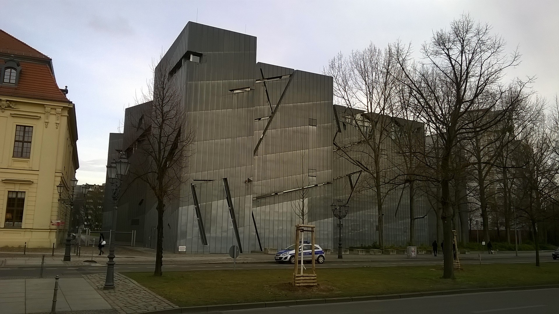
In the photograph: The strange roof covered in zinc.
It’s shape and design
The US architect and winner of the Pritzker architecture prize Daniel Liebeskind was in charge of designing the building. The architect of Jewish-Polish descent already had a strong body of internationally recognised work. His experience was necessary, it was no easy feat to design a building whose features break sharply with its context and surrounding area, especially with the adjoining Baroque style museum where the entrance is.
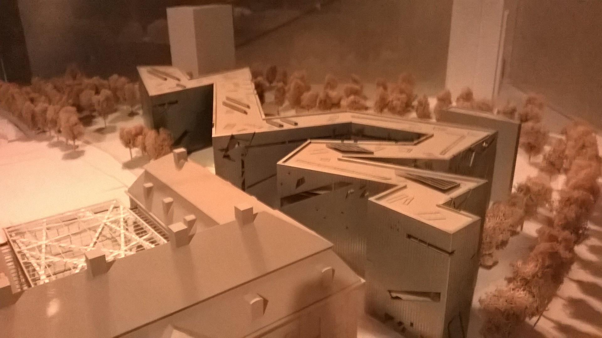
Without drowning in architectural terms or a prolonged explanation of the building all I will say is that the central theme is to represent the Jewish experience in Germany: of continuity, holocaust and exile.

In the photo: The miniature version of the building shows its peculiar zig zag shape.
An experiential museum
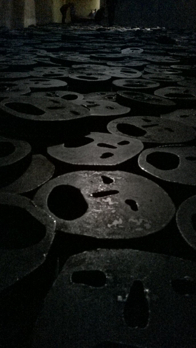
One thing I really appreciated about the museum was that as well as having relevant information about Jews’ suffering, it also has spaces which inspire profound reflection. An example is the Shalechet, a room which is empty bar thousands of metal faces piled over each other on the floor, representing the Jewish bodies destroyed during the holocaust. Menashe Kadishman, the creator of the piece, invites visitors to walk through the room, stepping on the faces without making any noise. The faces’ material and its irregular shape means that once stepped upon, they create eerie echoes. I couldn’t avoid thinking that each echo could be the shout of pain and suffering of a person.

In the photo: The thousands of “faces” with expressions of pain and angst piled on top of each other.
Another one of the rooms which leaves a bitter taste in the mouth is an empty space, around ten metres high where there is only a small window high up with the walls painted black. It makes you feel very lonely and cold. In the moment, you put yourself in the shoes of the Jews living in the concentration camps, how on many occasions it wasn’t the physical abuse which consumed their thoughts every day, but the emptiness and isolation they must have felt from the very beginning, being separated from everyone they loved. The moments when they realised that they had no one they could trust, or who would help them, so each passing day their hopes faded.
The exhibitions
The museum has two exhibitions, a permanent one which charts the two millenniums of German-Jewish history (it’s so much information that it is hard to cover it all in one visit). It includes the medieval communities to the Baroque period, emancipation, the First World War and the marginalisation and annihilation and then emigration. The second one is temporary and from what I understand they focus on different themes related to nationalism and Jews and Germans, each one lasting around a year before changing.
The garden of exile
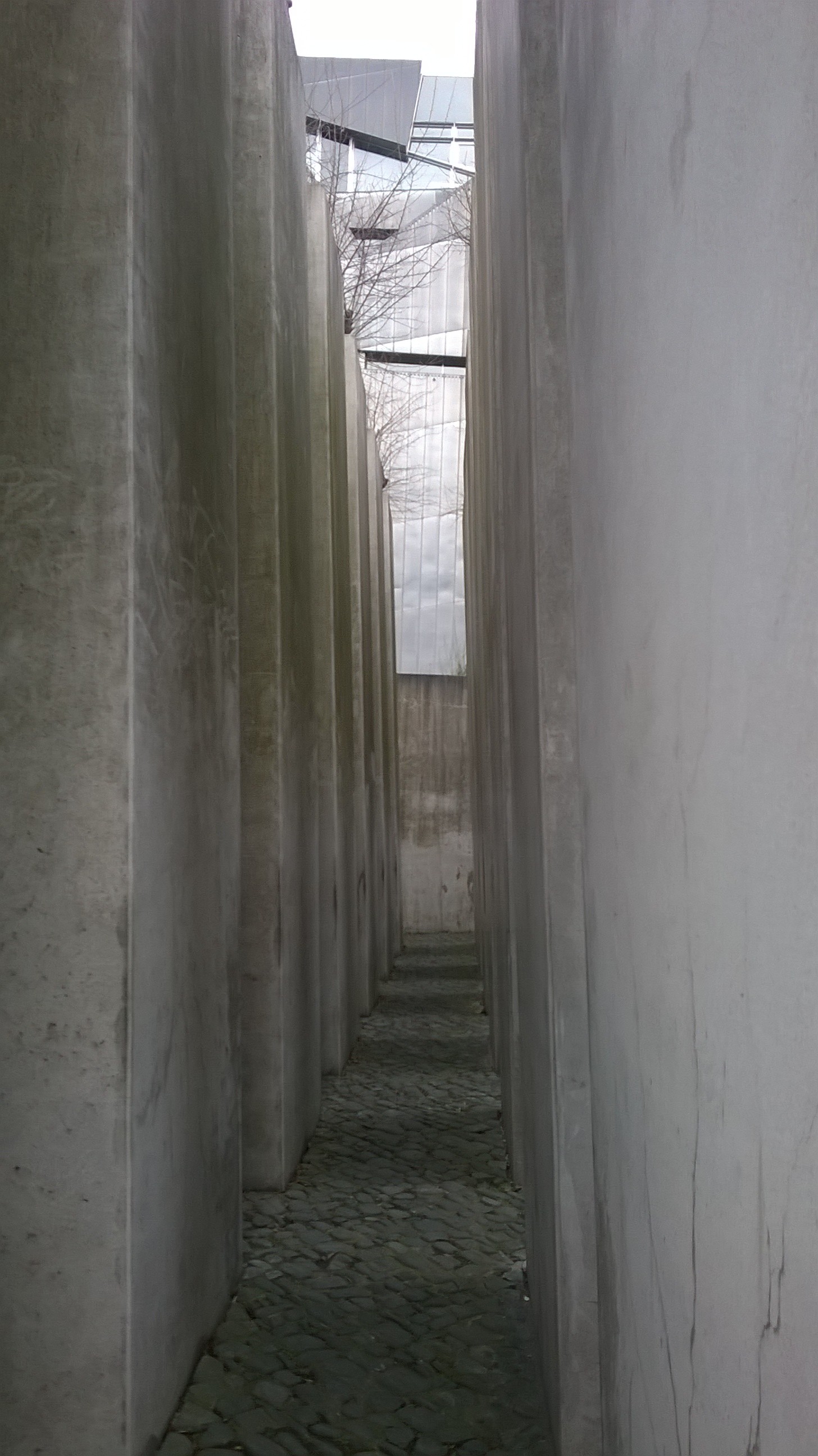
I have already mentioned that the museum is divided between three concepts: continuity, the holocaust and exile. The last of these themes is covered in this garden, officially called Josef Hoffman. In a square area, large, hollow pillars jut upwards, their tops covered with sprawling vegetation. As soon as I saw it, I couldn’t help but compare it to the Holocaust Monument designed by Peter Eisenman. For one, they both have enormous blocks of stone arranged in lines as well as a sloped walking path. Both, I believe, were designed to generate different sensations to the visitor when walking through them. At times I felt like I was in a labyrinth and other times like I was delving deep into a small forest.

In the photo: A view of the most “covered up” sides of the garden of exile, where you feel like you are in a labyrinth.
A deconstructive design with meaning
As an architect, I often criticise the deconstructive style. For those who don’t recognise the word, it is a style where the building or work does not seem to have any shape, it is destroyed, de – constructed (that’s where the name comes from). Often I am against this style as it seems a superficial whim of architecture, a fad. However, on this occasion, each interior and exterior element of the building seems to have a function. Each staircase and diagonal window generate a different view, making the journey through the museum, as well as the exhibitions, an uncomfortable exercise in understanding the Jewish experience in Germany as well as their suffering.
For me, as you can probably already tell, I really liked the museum. It has so much information that one trip alone is not enough if you really want to learn all the history.
