Colours and Amsterdam
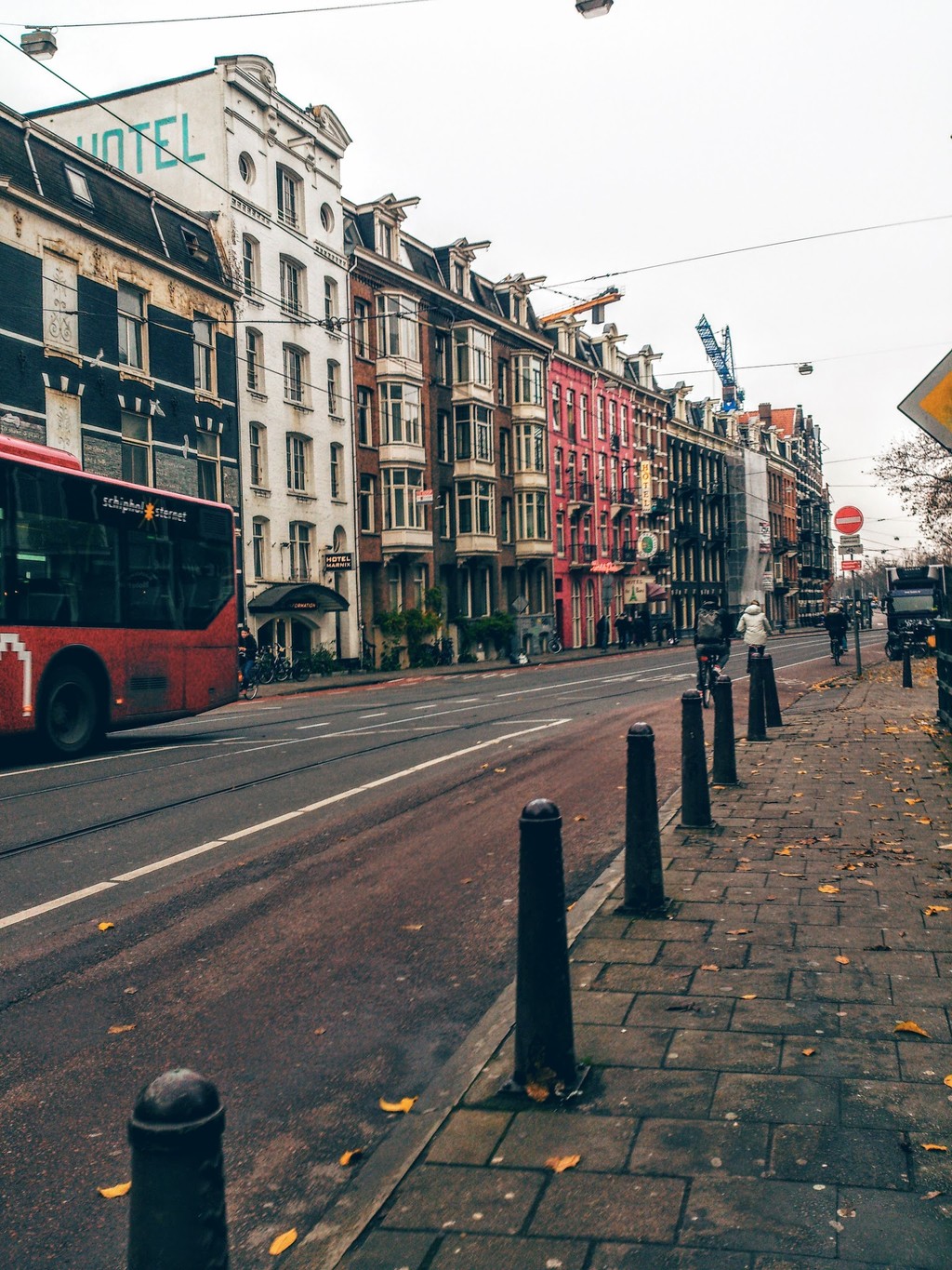
Everyone knows about the colours of the Netherlands. It is a country of tulips: we all have seen those vast valleys of different coloured tulips. What's more, we all have seen them in our minds and we have realised how colourful the Netherlands truly is!
First of all, when you arrive at the Amsterdam Schiphol Airport, the very first thing you notice are the planes. There are so many of them and so different from each other and poisoned on different colours. This is awesome! Then, I want to say, that when I visited the Netherlands it was November, so, we know it's not a habit in Georgia, but in Europe and USA they start Christmas decorations and stuff like that as early as even September! So or was the middle of November and, hence, of course there were Christmas and New Year decorations everywhere and it was amazing, I can say.
If you ask any of the artists, I'm pretty sure, that they will say, that autumn is the most colourful season of the year. And that is really true. The thing that I visited the Netherlands in autumn makes it even more colourful than usual.
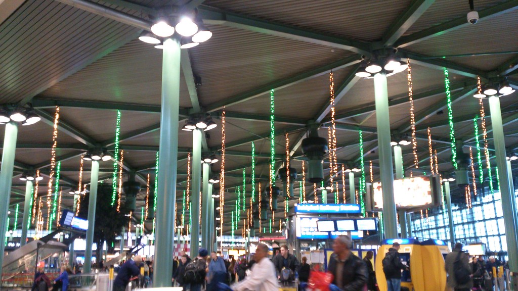
Colours… they are all around us. They make us smile, cheer, cry, be scared… why’s that?! Because we give them different meanings. They all have something to tell us. They are the perfect solutions when we want to show our feelings, ourselves or our inner voices, which don’t usually come out with crying out loud or just saying correct words. Colours decide many things in our lives and thus, they all have meanings and affect on us. That’s why I want to write about them. I want to develop my understanding of colours and at the same time give people knowledge about colours.
They say colour is the visual perceptual property corresponding in humans to the categories called red, blue, yellow, green and others. Colour derives from the spectrum of light interacting in the eye with the spectral sensitivities of the light receptors. That’s how colours are in an “official” way. But how can we understand each of them?
I guess the main point here is that while cultures differ from each other, colours change their meanings all over the world. For example, while colour red describes life in Japan, it can be a colour of mourning in South Africa; if colour yellow means jealousy in France, it reminds Jewish people of yellow star badges their ancestors were forced to wear. And in Thailand each day has its own colour: yellow for Monday, pink for Tuesday, green for Wednesday, orange for Thursday, blue for Friday, purple for Saturday, and red for Sunday. In addition, it’s really strange that in all western countries pink is considered as feminine colour and blue is colour for boys, but it’s vice versa in Belgium.
We all know that red is associated with love, black with death and bad things, white with purity and new things… but not the whole world agrees with this. I mean, in searching interesting facts about colours, I found out that every colour cannot mean the same to every country. For eastern countries, white means mourning and death.
So, how we define colours? For example, we know that red and orange colours have longer wavelength than others and that’s why the sky becomes red during sunset and sunrise. Does this information change our vision for colours? Yes, I think it does. But how? That’s a really good question and I think I have the answer: it depends on us how we define colours. I mean, if I was an artist, I would view colours not the same as physicist or a chemist.
●●●
"Artists can color the sky red because they know it's blue. Those of us who aren't artists must color things the way they really are or people might think we're stupid. "
- Jules Feiffer
●●●
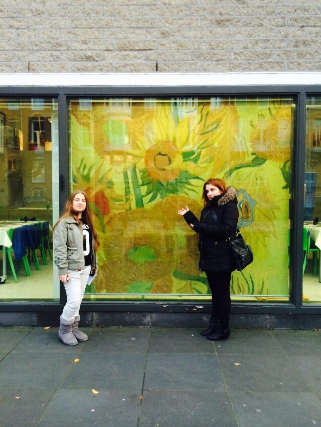
If I was an artist, I would probably say, that a colour is the element of art that is produced when light, striking an object, is reflected back to the eye. There are three properties to colour: hue, intensity, and value. The first property simply means the name we give to a colour (red, yellow, blue, etc. ). The second property alludes to intensity, which refers to the strength and vividness of the color. For example, we may describe the colour blue as "royal" (bright, rich, vibrant) or "dull" (grayed). The third and final property of colour is used to refer to lightness or darkness. The terms shade and tint are in reference to value changes in colours.
So, as an artist I could have imagined sunset and sunrise as something inspirational. I could have said that they are never the same and each of them, everyday, can make people want to live many years so that they will be able to watch sunset and sunrise over and over again and be impressed.
If you ask psycologists, they will say: “Colour is a form of non verbal communication. It is not a static energy and its meaning can change from one day to the next with any individual. ” And then they will tell you about these colours, For example, a person may choose to wear the colour red one day and this may indicate they are ready to take action, or they may be passionate about what they are going to be doing that day, or again it may mean that they are feeling angry that day, on either a conscious or subconscious level. And the colour yellow is the colour of the mind and the intellect. It is optimistic and cheerful. However, it can also suggest impatience, criticism and cowardice.
People have their favourite colours, I think. Or maybe they don’t know about this colour, but from my point of view, every person has a specific colour inside, which represents them. In fact, if they find that colour they will be able to check whether it is true or not about guessing people’s characters with the help of colours. I think everyone is interested in it, at least it’s all about our curiosity that makes us read about our favourite colour. Your personality colour does not have to be one you wear all the time; it is usually your favourite, the colour that excites you the most and makes you feel alive when you see it. That being said, you are often drawn to your personality colour for clothing and home decorating. It is often a predominant colour in your aura.
So this is information called “What does your favorite or personality colour say about you? ”:
- If your favourite colour is red, you are action oriented with a deep need for physical fulfilment and to experience life through the five senses.
- If orange is your favorite colour, you have a great need to be with people, to socialize with them, and be accepted and respected as part of a group. You also have a need for challenges in your life, whether it is physical or social challenges.
- Choosing yellow as your favorite means you have a deep need for logical order in your everyday life and to be able to express your individuality by using your logical mind to inspire and create new ideas.
- If green is your favourite, you have a deep need to belong, to love and be loved, and to feel safe. You need acceptance and acknowledgement for the everyday things you do for others. Just a 'thank you' is sufficient.
- Lovers of blue have a deep need to find inner peace and truth, to live their life according to their ideals and beliefs without having to change their inflexible viewpoint of life to satisfy others.
- If purple or violet is your favorite colour, you have a deep need for emotional security and to create order and perfection in all areas of your life, including your spiritual life. You also have a deep need to initiate and participate in humanitarian projects, helping others in need.
- If your personality colour is pink you have a deep need to be accepted and loved unconditionally.
- If turquoise is your favorite colour your deepest need is to create emotional balance in your life, to be able to express your hopes and dreams no matter how idealistic they may be and to make your own way in the world under your own terms.
- Lovers of brown have a deep need for a safe, secure, simple and comfortable existence with supportive family and friends.
- Lovers of black have a need for power and control in order to protect their own emotional insecurities.
- If white is your personality colour, your deepest need is for simplicity in your own life and to be independent and self-reliant so you do not need to depend on anyone else.
- With gray as your favorite colour, you are the middle of the road type, cool, conserved, composed and reliable. You tend to conform just to keep the peace.
- With a personality colour gold, you radiate charisma, personality and individuality, making others feel relaxed and valued in your company.
Once I read an article about colours and how they could help us. It said “you should have 6 pieces of paper, each with one colour: red, blue, yellow, orange, green, purple (or violet). Each colour gives you some “power” and if you want that, you should put one of the pieces in front of you and look at it for about 5 minutes. ” So I decided to try this experiment and I did this for about 2 weeks. I can say, it’s really working. Maybe it’s all about self-assuring and these colour cards have nothing to do with gaining this “power”, but it really helps, I think.
Nowadays, computers are widely used and so are computer programmes. I can say that the vision has changed a little bit and for every colour we associate some programmes, webpages, etc. for example, skype is associated with light blue, Twitter with turquoise, Facebook with blue, Youtube _ with red, Blogspot with orange, IMDB with yellow, Yahoo with purple, 9GAG with black, GOMplayer with orange, Internet Explorer with light blue, Opera with red, etc.
Let’s take colours and say what we associate with them.
Red
First of all, it reminds us about blood of course. Then it can be followed by roses, autumn leaves, fruits such as: cranberries, strawberries, watermelon, apple, cherries… revolutions, heart, red carpet for movie stars on Oscar ceremony and others, seats in opera houses and theatres are traditionally red, and of course Santa Clause wears red because the original Saint Nicholas was a bishop of the Greek Christian church in the 4th century. Red can also be associated with the STOP sign, red card in football, telephone boxes in and Queen’s guard in England. Cardinals of the Roman Catholic Church wear red too.
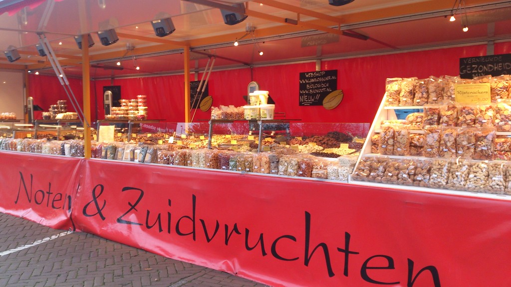
Green
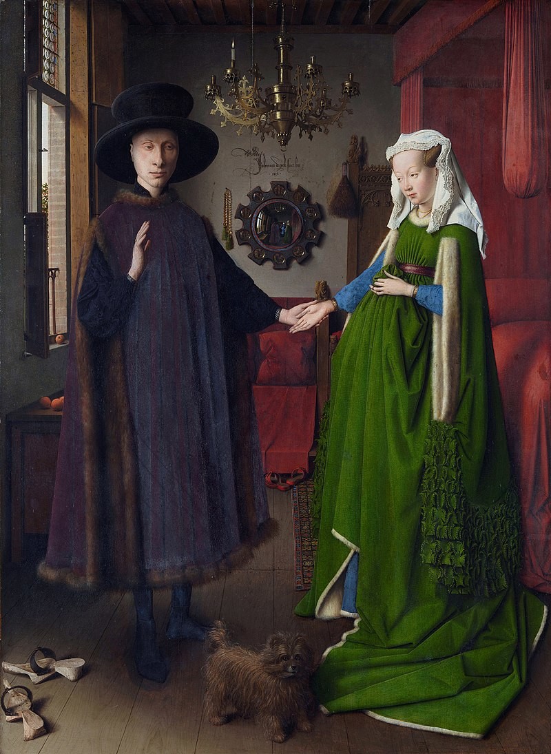
It’s associated with grass, lime green, green tea, forrest, trees, nature, U. S. dollar, camouflage, Machu Picchu in Peru, the chloroplasts of plant cells, snakes, frogs, cucumbers, lettuce, cabbage, the Amazon River… The bride in the Arnolfini portrait by Jan Van Eyck wears an amazing green dress, The Chicago River is dyed green every year to mark St. Patrick's Day. A billiards table is coloured green after the lawns where the ancestors of the game were originally played.
Blue
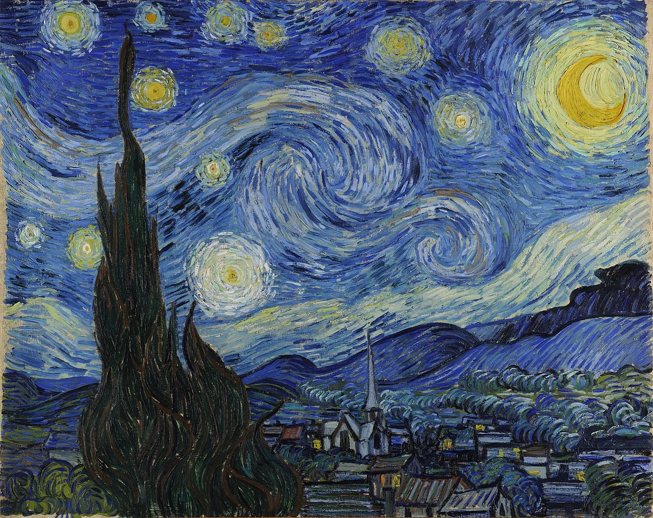
Blue is associated with the sky, water, computer desktop, jeans, blueberries, blue sapphire, Van Gogh's Starry Night Over the Rhone (1888), where blue used to create a mood or atmosphere: cobalt blue for the sky, and cobalt or ultramarine for the sea. The Coronation of King Louis VIII of France in 1223 showed that blue had become the royal colour.
Yellow
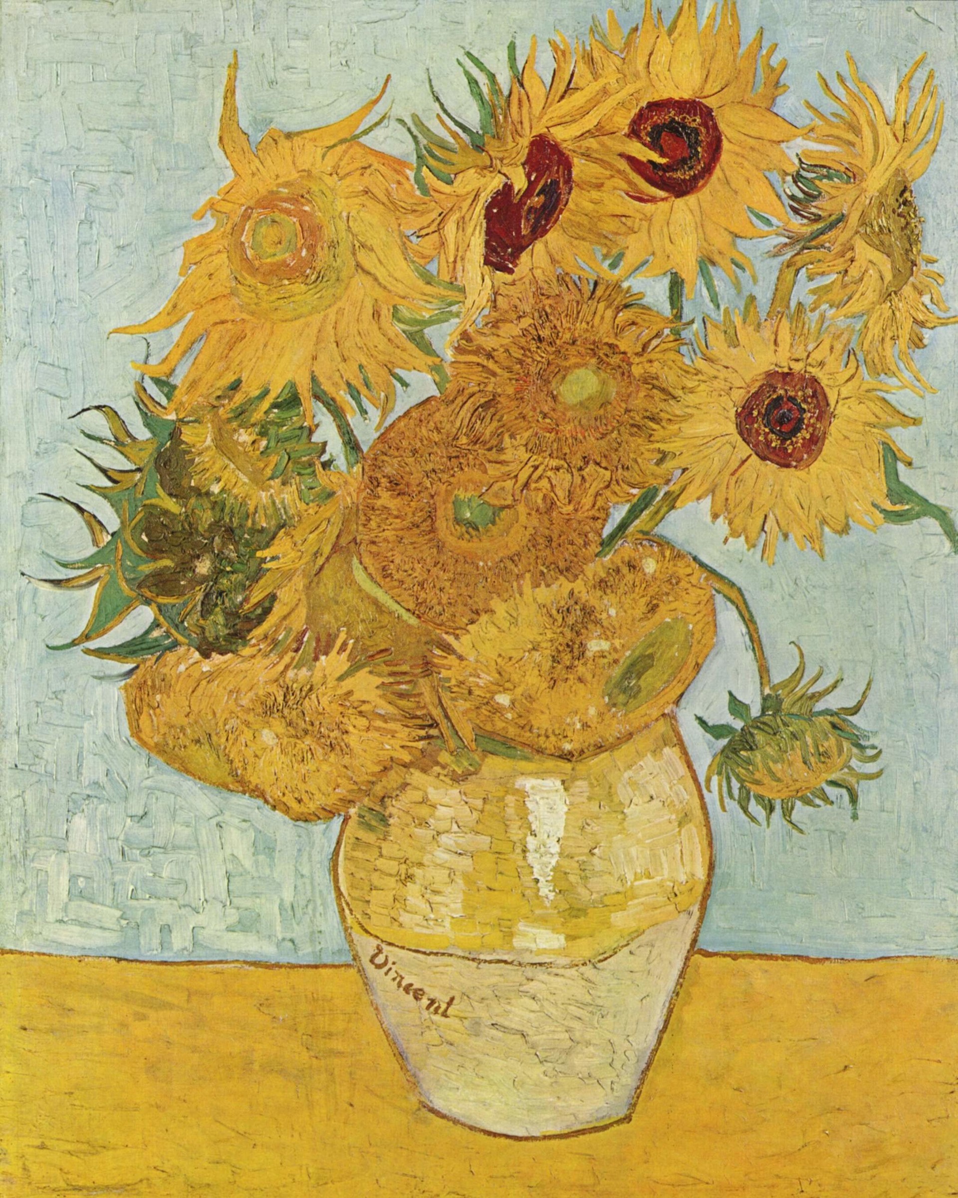
Yellow is associated with the Sun, stars, the Moon, daylight, autumn, lemon, bananas, school buses, New York cabs, yellow cards in football, Buddhist monks, yellow badges, yellow buses in Tbilisi, an egg, Sunflowers (1888) by Vincent Van Gogh is a fountain of yellows. While painting “Rain, Steam and Speed the Great Western Railway” (1844) British painter J. M. W. Turner used yellow clouds to create a mood, the way romantic composers of the time used music. The Pope traditionally wears gold and white outside St. Peter's Basilica.
At some point, it can be said that we don’t define colours, but they define us. Little by little, we can see that we are so used to seeing colours that they have become something we take for granted. We can judge the significance of colours with the fact that most are associated with our emotions and different activities in life. For example, blue colour can be associated with sea for me.
But have you ever imagined life without colour? What if our life had no colours? How would things look, and most importantly, how would our pictures look? It would be a monotonous white, black, gray, white, black, gray… it would be boring, not cheerful, dull… but not something usual I admit, for us. And if we had that white-black life for some time and then if the colours came back to us, we would certainly see what splendid it is to live and see this colourful world in colours! If you see these pictures, then you’ll understand how colours make our lives different.
So I can say that it’s the colours that make our lives special. Otherwise monotony would swallow us. Colours make our lives wonderful. They make us smile, be happy, cheerful. They can impress us, amaze us, excite us… they make us be interested in something; they encourage us. They confuse us when we see colourful things in markets and stores and other places, but then we understand that we’ve come to right place. We love colours! However, we should not just love them. In fact, we should protect them from becoming nothing in our lives. We shouldn’t make them become usual parts of our everyday vision. Colours should always be magical for us.
Photo gallery
Content available in other languages
- Español: Los colores y Ámsterdam
- Italiano: I colori ed Amsterdam
- Français: Les couleurs et Amsterdam
- Polski: Kolory i Amsterdam
Want to have your own Erasmus blog?
If you are experiencing living abroad, you're an avid traveller or want to promote the city where you live... create your own blog and share your adventures!
I want to create my Erasmus blog! →


Comments (1 comments)
This is a very good article and really interesting. Great job!